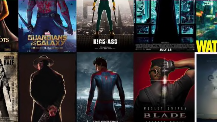
Ever looked at a movie poster and could swear you’ve seen it before? If not, I’m sorry if we’re about to disillusion you to the idea that Hollywood is a rich playground for boundless creativity, and if yes, this’ll still be fun anyway. Cheddar has put together a really cool video exploring the common patterns found in many movie posters, and why they recur with such frequency:
Well, I’ll never be able to look at a poster of someone standing dramatically with their back to the camera the same way again. Also, I remember the era of giant faces hovering over a normal scene from the movie. Good times.
RELATED PRODUCT

Colorado Rockies Nolan Arenado Game Of Thrones Iron Throne Bobblehead
Buy Now!
Buy Now!
So these images definitely recur, and if Cheddar is right, the reason is because Hollywood market research has indicated that they work, which is depressing, because we’re unlikely to get much variance in the future.
On the other hand, I find it intriguing that none of this year’s Best Picture contenders had posters that followed the standard templates. I mean, it’s not like the people who designed those posters knew the movies were going to be up for Academy Awards, so that can’t be part of the reason. Maybe it’s that movies likely to be nominated for Best Pictures tend to be managed by bold, risk-taking people willing to let the artists go a little outside the box when designing posters? Feel free to throw thoughts into the void with me.
To stay up to date on everything Game of Thrones, follow our all-encompassing Facebook page and sign up for our exclusive newsletter.
Watch Game of Thrones for FREE with a no-risk, 7-day free trial of Amazon Channels
