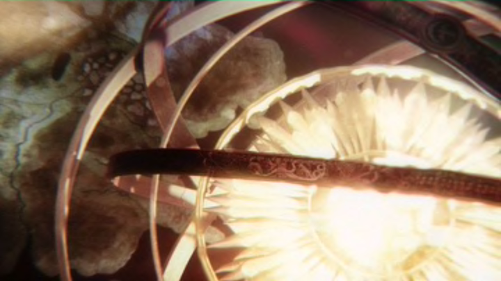
Game of Thrones has one of the most iconic opening titles sequences of all time. We all know the music (DA da dada DA da dada DA da dada DA da dada dooooo dooooo do do dooooo…) as well as the visuals: the camera sweeps over a stylized map of Westeros, showing us the places we’re going to visit in the upcoming episode. It wasn’t just cool to look at, but also practical.
Now, everybody’s tuning in to House of the Dragon, a Game of Thrones prequel series set some 200 years before the original show. The producers decided not to include the opening titles sequence in the excellent premiere episode, but it made its debut this week in “The Rogue Prince.” You can watch the sequence here.
So how does this new opening titles sequence compare to its predecessor? Unfortunately, not well.
The opening credits sequence of House of the Dragon falls short of Game of Thrones
To start, the House of the Dragon title sequence uses the same song as on Game of Thrones. That’s a little disappointing considering how talented a composer Ramin Djawadi is, but on the other hand, I can understand if they didn’t want to mess with perfection. The song is still iconic and we’re not done humming it. Fine.
For me, the real problem are the visuals. What exactly am I looking at? On Game of Thrones, it was clear from the jump that it was a map. Here, we see some seals oozing blood as the camera races around some kind of model castle. It may be King Viserys’ model of Old Valyria? But if so, why? And what do all the seals mean?
It looks like the credits are telling the story of the Targaryen dynasty. Each seal represents a different Targaryen who has died over the years, and the lines of blood that spill out represent their progeny. That’s not a bad idea — the history of the Targaryen family is definitely an important part of House of the Dragon — but it’s nowhere near as visually intuitive as the Game of Thrones opening was. We don’t see the seals for nearly long enough to register what they mean, the interior of this model is uniform grey stone throughout, and we never pull back to get a look at the whole.
I don’t like it, or at least I don’t like it nearly as much as the Game of Thrones opening credits. The Targaryen family has a rich, exciting, bloody history. Surely there was a better way to dramatize it. Perhaps looking at tapestries depicting the big events in the dynasty’s history? Or maybe something that was more clearly a family tree, ornamented with something more readily identifiable than hard-to-make-out sigils.
Obviously, that’s just me. What do you make of the new opening credits?
To stay up to date on everything fantasy, science fiction, and WiC, follow our all-encompassing Facebook page and sign up for our exclusive newsletter.
Get HBO, Starz, Showtime and MORE for FREE with a no-risk, 7-day free trial of Amazon Channels
